Why, and how, do some traders who draw lines on charts, look at dual axis time series, regress prices against prices, make money?
cope harder anon

donate to magic breakfast and fill up this form for free access
Welcome back my friends. Today I'm gonna go on a lil soliloquy on a this topic. Am I qualified to talk about making money? No. Will I still talk about it? Yes.
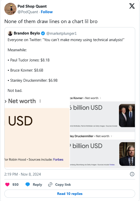
Recently, there was this tweet that caught my attention.

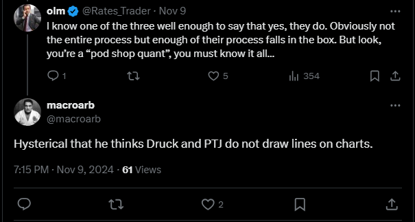
And apparently that sparked quite big of debate in the replies. And there are some others, who claim that they know one of 3 legends well enough, and they definitely draw some lines.

I can tell you something from personal experience (hypothetically). Hypothetically, I work at one of big pod shops. And hypothetically, I might have worked under a senior Macro PM who was absolutely killing it, and he defo drew some lines on charts. (All these are hypotheticals, I could be just a uni drop out or wtv)
Which puzzles me as someone on the "quant" side. I mean, drawing lines on martingales-ish charts surely isn't informative, right? Others have suggested before that lines on charts merely capture a momentum effect. Personally, I think that's plausible but not entirely convincing, and—at the risk of claiming an authority I do not possess—I find it a bit facile and simplistic.
So today I will tell The Tale of Two Traders. Both of them are macro traders (don't boo). One is doing regression on returns and has a pretty good forecast. The other, is doing regressions on prices vs prices, and mistakenly concluded the relationship between the feature and forward returns. Despite that, the latter trader ends up being more profitable. We will go through some proof of how a forecast that is strictly inferior, can end up with a superior strategy (no it's not because of luck, execution cost, slippage, fill etc). And this also has a kinda huge implication on how we approach modeling and alpha research in the quant world. Let's get it.

